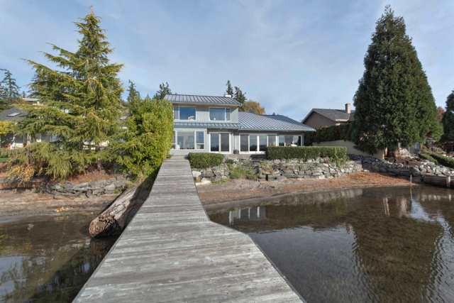
Before and after residential remodel
These clients are an active family of five with two kids still at home. They needed to add some space and update this lakeside home. The home was built in the late 1990’s and needed an update. Pink granite countertops paired with pink walls throughout the house weren’t the aesthetic our clients were after. Pretty quickly after buying the house they set to work remodeling it.
Exterior details
Our clients needed to add one more bathroom and bedroom, Arbour North Architecture found a creative solution. The solution also improved the roofline. In addition, they opted to use clear finished cedar siding paired with flat panel hardie plank siding. It’s pretty eye catching!
Kitchen
The original kitchen was certainly functional but there was a lot of unused floor space. For the redesign we added an island and retained the peninsula. In addition, all of the surfaces were updated with white quartz, flat panel walnut cabinets from Smith and Vallee, stainless appliances and white oak flooring.
Master bathroom
The layout of this space changed very little but the aesthetics certainly did! The maple cabinets were replaced with walnut, flat panel cabinets by Smith and Vallee and the pink granite was replaced with white quartz and glass tiles. The new space is contemporary, bright and sharp.
Living room
Those pink walls, they worked at one time but not in 2017. White paint, white oak flooring, flat front walnut cabinets, large format porcelain tile for the fireplace surround and built-ins transformed this living room. Another huge change was the addition, which is only noticeable from the living room when you look at the extended catwalk.
See the full portfolio and more project details here.
Photo credit for all final photos to Chris DiNottia.


 by Intellitonic